Global Themes
Global application themes are shared between all your content types and act as default styles when configuring your content. To get you started quickly, GuideWhale will create light and dark themes based on your initial organization setup, which you can modify further or create your own custom themes.Creating a Theme
Start by navigating to Dashboard > Themes, where you can see theAdd Theme button at the top right of the page. Clicking it will create a theme with default settings, which you can then adjust to further match your brand colors.
General
To ease the process of configuring a new theme, GuideWhale provides you with a simplified configuration screen that allows you to adjust the theme’s title, description and the most commonly used settings.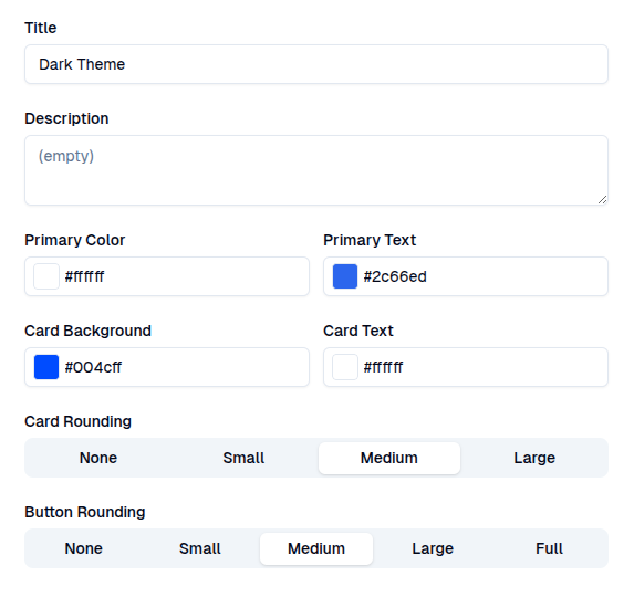
- Title: the theme’s title to easily identify it in the list of themes.
- Description: a quick description of the theme so that your team knows its purpose.
- Primary Color: the main color of the theme, used for primary buttons, checklist and resource center launcher widgets, and application target element highlighting.
- Primary Text: color of the text within a highlighter or launcher widget.
- Card Background: background color of the content window. If you want to make your help content stand out, you can make this the same as your primary color.
- Card Text: color of the text within the content window. This should have a high enough contrast to be readable.
- Card Rounding: content window border rounding. This should be set to best match your application’s container style.
- Button Rounding: content button border rounding. This should be set to best match your application’s button style.
Content
Main configuration for how your content cards will appear to your users.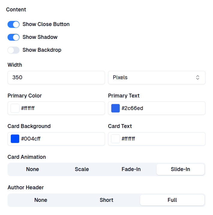
- Close Button: display an ‘X’ button at the top of the content card, allowing users to dismiss the content.
- Drop Shadow: show a subtle drop shadow behind the content’s card, giving it more dimensionality.
- Blocking Backdrop: shows a blocking backdrop around the content card, focusing the user’s attention on the guide steps. If the target element is highlighted when the backdrop is enabled, everything around the target element will be blocked.
- Width Limitation: limit card width to best match its content. If the width is bigger than the available screen space, the content card will shrink and become scrollable.
- Primary Color: the main color of the theme, used for primary buttons, checklist and resource center launcher widgets, and application target element highlighting.
- Primary Text Color: color of the text within a highlighter or launcher widget.
- Card Background Color: background color of the content window. To make your help content stand out, you can make this the same as your primary color.
- Card Text Color: color of the text within the content window. This should have a high enough contrast to be readable.
- Card Animation: different entry and exit animations when showing or dismissing the content card.
- Author Header: adds a personal touch to the content by showing the author’s details at the top of the content card.
Layout
Configure spacing between content elements and z-index to control how content is displayed on top of other elements.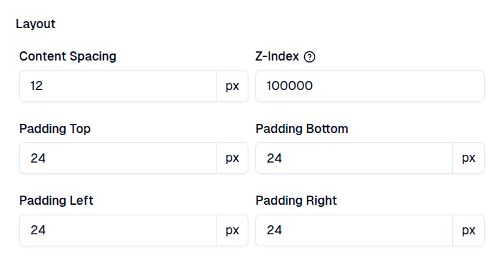
- Content Spacing: set vertical and horizontal spacing between content elements (text, images, videos, buttons).
- Z-index: set the layering order of content elements. A higher z-index means that the content will appear on top of other elements with a lower z-index. This is useful if you want your content to appear on top of other elements in your application. For example, if you want to show a tooltip on top of a map, you can set the z-index of the tooltip to be higher than the map’s z-index.
- Padding (Top, Bottom, Left, Right): fine-tune the spacing between card content and border.
Font
Configure text appearance and which font family should be used inside your content.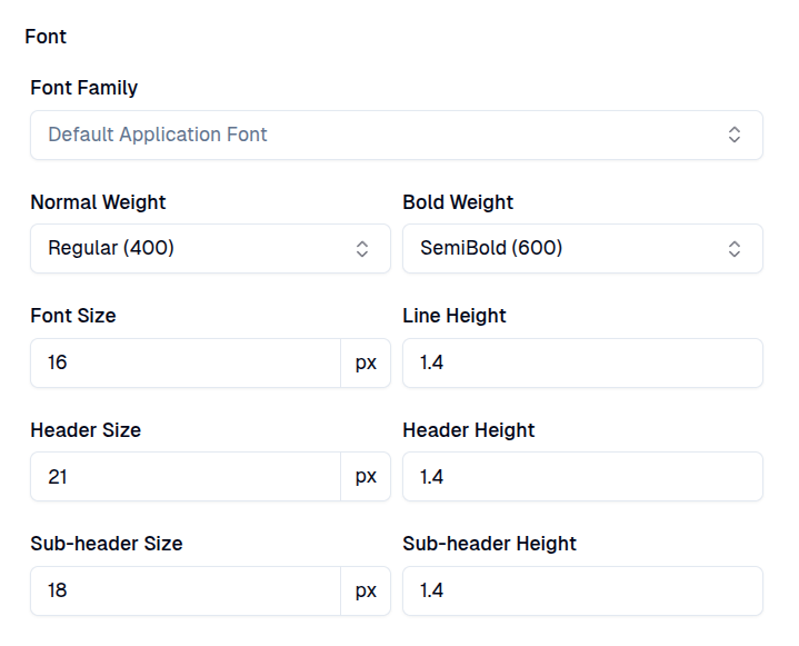
- Font Family: choose a font family to match your application’s typography style. If not set, the global font family from your application will be used as a default.
- Normal Font Weight: default font weight when text is not bolded.
- Bold Font Weight: font weight when text is bolded.
- Font Size: regular paragraph text size.
- Line Height: regular paragraph text spacing between lines.
- Header Size: main H1 header text size.
- Header Height: main H1 header spacing between lines.
- Sub-header Size: H2 subheader text size.
- Sub-header Height: H2 subheader spacing between lines.
Buttons
Customize the appearance of your content buttons, including guide step footer navigation buttons, to match your application’s style.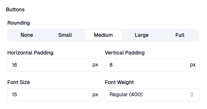
- Rounding: set the border rounding of your content buttons to best match your application’s style.
- Horizontal Padding: adjust the horizontal spacing between the button text and its border. A good rule of thumb is to set this to double the vertical padding.
- Vertical Padding: set the vertical spacing between the button text and its border.
- Font Size: adjust the text size of any text inside the button.
- Font Weight: adjust the text weight of any text inside the button.
Primary Button
Configure primary button border, resting, hover and click colors to best match your application. Primary buttons typically use the primary background color or the color of your text content.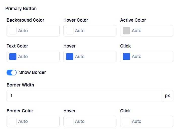
- Background Color (Resting, Hover, Active): button’s background color when resting or when being interacted with.
- Text Color (Resting, Hover, Active): button’s text color when resting or when being interacted with.
- Show Border: determines whether the button should display a border or not.
- Border Width: specifies how big the button’s border should be.
- Border Color (Resting, Hover, Active): button’s border color when resting or when being interacted with.
Secondary Button
Configure secondary button border, resting, hover and click colors to best match your application. Secondary buttons typically have the same background as your content card, but add a border to preserve the button shape.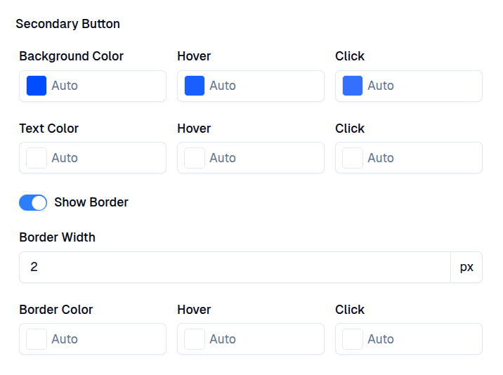
- Background Color (Resting, Hover, Active): button’s background color when resting or when being interacted with.
- Text Color (Resting, Hover, Active): button’s text color when resting or when being interacted with.
- Show Border: determines whether the button should display a border or not.
- Border Width: specifies how big the button’s border should be.
- Border Color (Resting, Hover, Active): button’s border color when resting or when being interacted with.
Highlight
Highlights are a powerful way to capture your users’ attention and guide them to use new features or other important parts of your application that they haven’t explored yet. By using a bounding box or a hotspot circle, you can hint at the importance of specific elements and encourage users to interact with them. Highlights are particularly useful when building product tours or help guides as they provide a clear way to draw attention to important elements or guide steps. By using highlights, you can create a visually appealing and engaging experience for your users.-
None: disable highlighting and simply place the content next to the target element. This is useful for quick hints where the target element is not important.
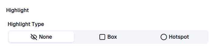
-
Box: highlight your target elements with a surrounding box shape. This is useful when you want to draw attention to the entire target element, such as a form input field where the user needs to enter a value.
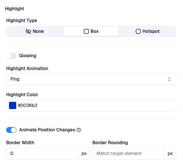
- Glowing: enables a glowing effect around the border to make it more noticeable.
- Highlight Animation: is used to set different pulsing or pinging animations to attract attention.
- Highlight Color: defines the color of the box highlight, including border and animation.
- Animate Position Changes: animates box position changes between different target elements to simulate cursor movement around your application when following guides.
- Border Width: define a surrounding border around the target element.
- Border Rounding: add box rounding to fit the target element. This value is generated automatically when a new target element is selected.
-
Hotspot: highlight a specific point inside the target element, such as a piece of text or other part of the element.
This is useful when you want to draw attention to a specific part of the target element without highlighting the entire element.
Hotspots are also useful for guiding users through your application, as animated position changes can simulate cursor movement around your application when following the guide.
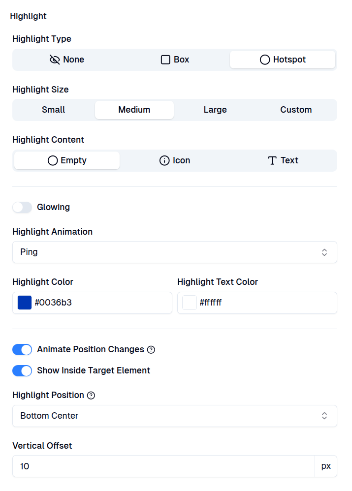
- Highlight Size: defines the diameter of the highlight circle.
- Highlight Content: defines what should be shown inside the hotspot:
- Empty: no content inside the hotspot.
- Icon: use an icon to distinguish between different hotspot types, such as warnings or hints.
- Text: add custom text to elongate the hotspot and create a badge-like effect.
- Glowing: enables a glowing effect around the hotspot circle to make it more noticeable.
- Highlight Animation: is used to set different pulsing or pinging animations to attract attention.
- Highlight Color (Background, Text): defines the colors of the hotspot circle and its text.
- Animate Position Changes: animates hotspot position changes between different target elements to simulate cursor movement around your application when following guides.
- Show Inside Target Element: specifies whether the hotspot should be shown inside or outside the target element’s borders.
- Highlight Position: defines the position of the hotspot in relation to the target element.
Backdrop
Configure the visual styles of a blocking backdrop, which is typically used for modal windows or blocking guide steps. This ensures that your users remain focused on the content and don’t stray away from following the guide.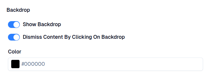
- Show Backdrop: configure whether content using this theme should show a blocking backdrop by default.
- Dismiss Content By Clicking On Backdrop: configure whether content can also be dismissed by clicking on the backdrop, in addition to the close button.
- Color: set the color of the blocking backdrop. Note that a fixed opacity will be applied to make the backdrop see-through.
Links
Configure clickable page link styles.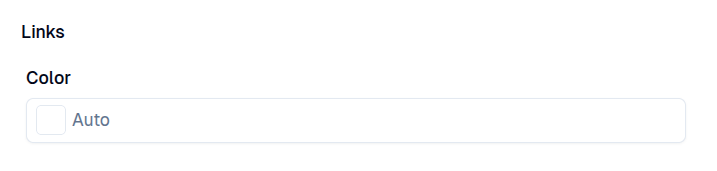
- Color: clickable link color inside text content. This is typically the same as text color or blue.
Guides
Configure default guide step navigation buttons and completion progress indicator.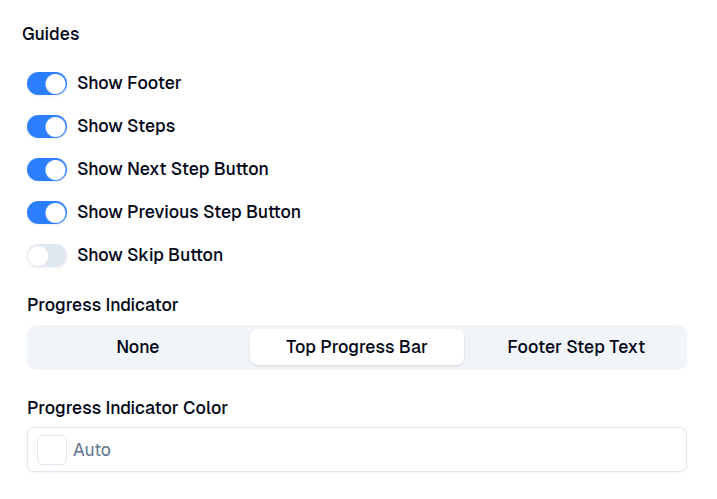
- Show Footer: whether the guide step should show the navigation footer with next and previous buttons.
- Show Steps: whether the guide step footer should show a step number.
- Show Next Step Button: whether the user can navigate to the next guide step using a footer button.
- Show Previous Step Button: whether the user can navigate to the previous guide step using a footer button.
- Show Skip Button: whether the user can dismiss the guide using a footer button.
- Progress Indicator: configures the progress indicator type to be shown for each guide step.
- None: just show the content without any step index indication.
- Top Progress Bar: show a filling bar at the top of the guide step.
- Footer Step Text: show the step indicator text in guide step’s footer.
- Progress Indicator Color: sets the color of top progress bar indicator.
Target Element
Configure the timeout actions for when the target element cannot be found. A timeout can occur if a user changes the page and the target element is no longer present, or if your application has changed enough that the configured CSS selector can no longer find the target element.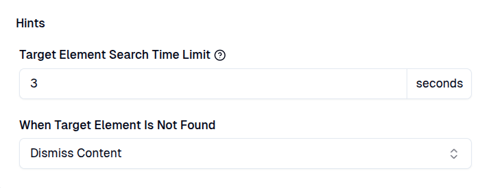
- Target Element Search Time Limit: how long to search for the content target element before executing the fallback action.
- When Target Element Is Not Found: fallback action to take when the target element is not found on the page within the specified time.
- Dismiss Content: automatically dismiss the content as if the user had manually closed it. If the content was never shown because it requires a target element, the user will not start a new content session and view time will not be recorded.
- Fallback to Position: the position to fall back onto when the target element is not found within the specified time.
Custom CSS
If existing theme settings don’t meet your requirements, you can add your custom CSS to be used inside GuideWhale content.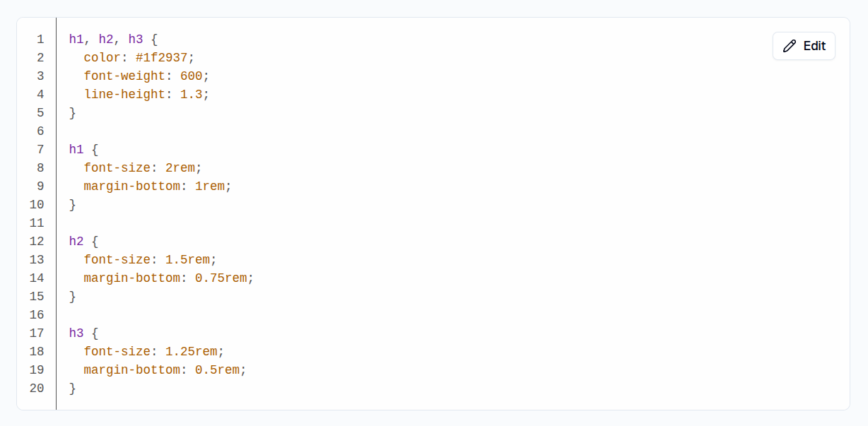
Preview
You can preview different content types when configuring your global theme using the preview window on the right side of the screen. This ensures that your styles match the desired look across all GuideWhale interactive content.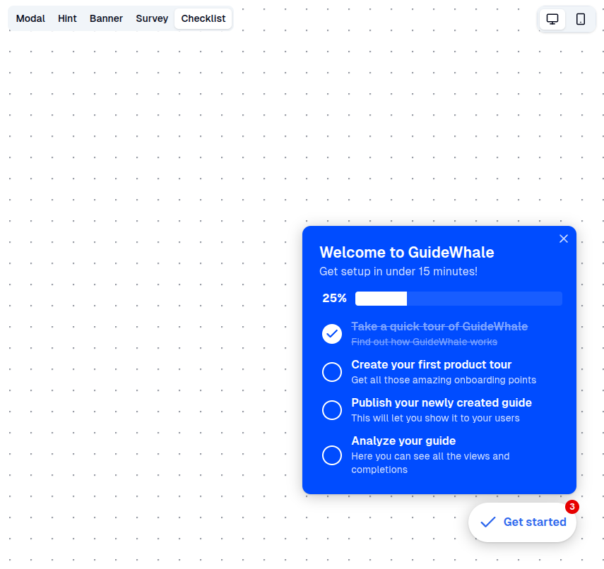
Custom Content Theme
Custom themes are unique to each individual content record and allow you to override base global theme styles independently of one another. The primary use case for these overrides is small tweaks dependent primarily on content card position and inner content size (e.g. increase card width for better readability).- Show Close Button: useful for when you want your users to acknowledge a message by pressing another button or clicking an element to dismiss the content.
- Show Shadow: useful for when you don’t want your content to stand-out from the background. This is primarily useful for embedded content that lives inside or next to your existing elements (e.g. embedded banners).
- Show Backdrop: can be used to block certain modal windows or focus the user’s attention on highlighted content.
- Width: some content types are better suited to having their own unique widths.
- Colors (Primary, Text, Card Background, Card Text): should be used sparingly and only when you want to add some extra content highlights.
- Card Animation: you can animate content cards differently depending on position and display context.
- Author Header: show the author’s details where you want your content to appear more personable.